This is a very important step in the pre-production stage. The look and feel of a character can influence what audience will think of them even before they move. There are many aspects to consider for character design, but I find these are the most important concepts to employ.
Silhouette
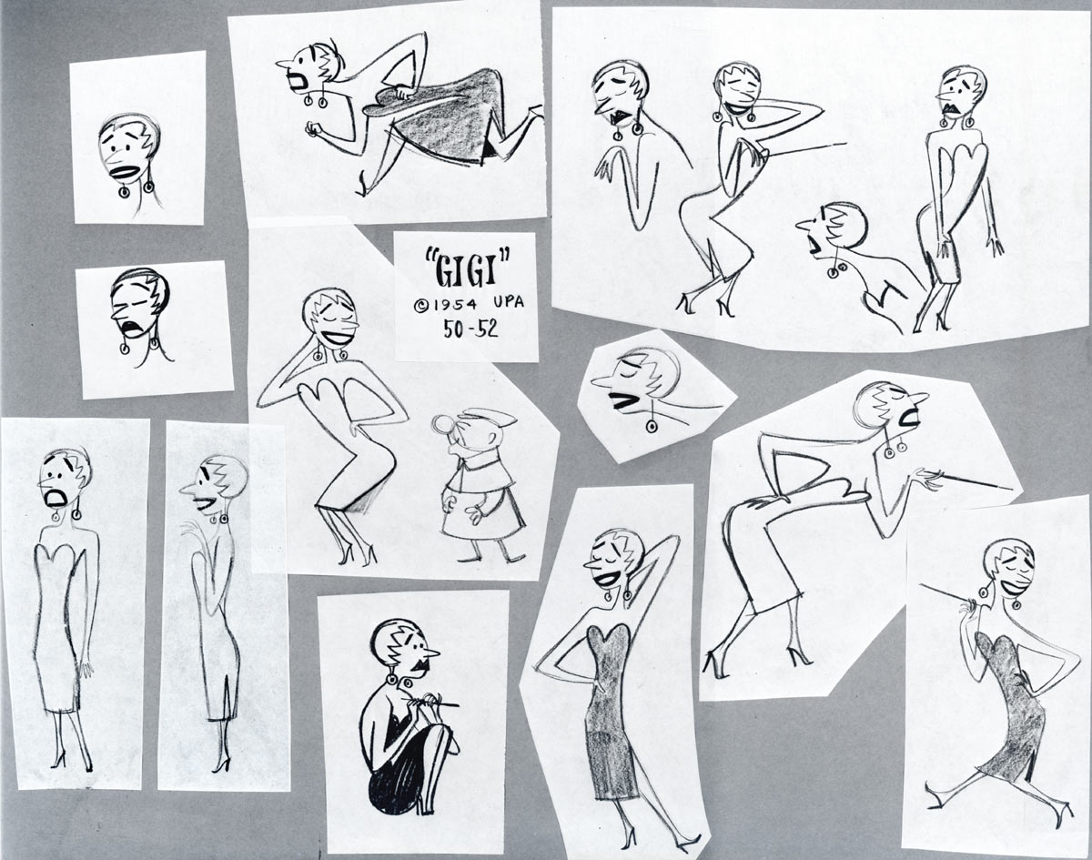
Simple shapes will make up your character. This is to help construct the character and gear it towards animation, but also to establish the character type. The weight and strength of a character should be obvious right away through silhouette. Look at your character from a distance. Even though you are not able to make out textures and details, they should be easily recognized. Think of the type of personality you want to give your character. If you have a villain you may want to make them large and ape like in silhouette, giving them a strong, intimidating physique (Gaston, Bluto, Ursela). Conversely, you may want your villian to be thin and wirey, taking on more of a evil mastermind role (Cruella Devil, Scar, Jaffar)

Plan
What makes you like your favourite characters? How are they constructed? Can they be easily animated and deconstructed into simple shapes? It can be helpful to think of these things. What makes some more successful and appealing than others? You may surprise yourself. Honestly, consider the painstaking hours of work that goes into animation. The design that you may have in mind, might be a great illustration but not so easy to animate. Pose out your character and don't be afraid to change or even scrap your idea to move into a more affordable direction. Also, consider your story. What will your character need to perform? Does the design allow for these actions?
Colours can help to further reinforce your character's personality. Evil colours tend to be dark. Light colours or bright colours tend to be more playful, good and pure. Walt Disney was a master at creating mood and atmosphere. Colours were no less intentional. Lots of blacks, dark purples and unnatural colours were used in many if not all villainous Disney characters.


Colour can also be very distracting. To maximize your use of colour, use it to highlight where you want the viewer to look. If you use lots of colour all over your character there won't be any focus.
Dive in and experiment what range of expressions you can hit with your character. Will your character allow for wild and exaggerated jaw drops and bug-eyed surprise? or is your character very human like and stays within a more subtle range of emotion. Examples of this could be found in the work of John K. or Tex Avery. When excited their character's eyes pop out of their head, jaw drops and tongue rolls out of their mouth. Harley Quinn is more human-like and natural. She can be expressive, but really stays within the same range as you or I would.

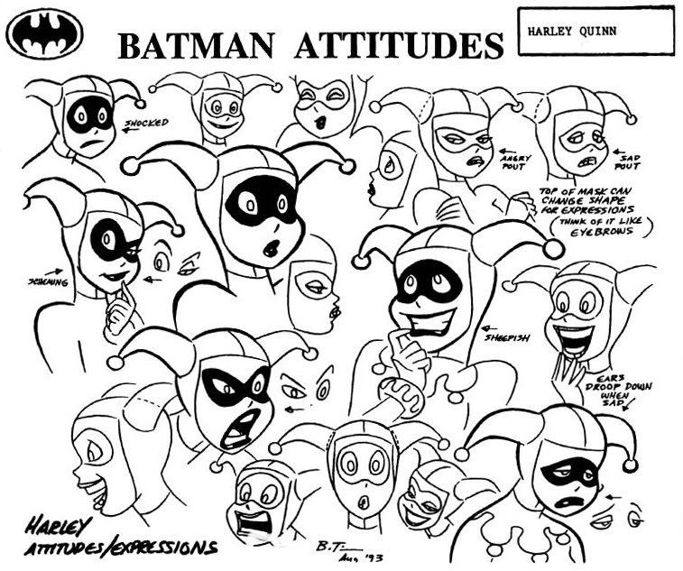


![[source]](http://media.photobucket.com/image/harley+quinn+expressions+/katrinakarnivore/Harley%20Quinn/3330375253_83fa25daf7_o.jpg)
No comments:
Post a Comment