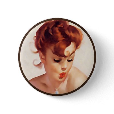
Rita did not choose an easy photo to start with, but I think she had lots of success. She did a great job on the skin. Skin tones can be very tricky, especially when working from a photograph. Photos tend to make the skin look smooth and often does not provide much in the way of contrast. Check out those bright yellow highlights for the blonde. So awesome.
Like I was discussing in class last week. I propose we start a side project. This is just a little something to get your painting skill flowing. I am totally inspired by the blog, http://30minspeedpaint.blogspot.com/ Imitation is the highest form of flattery, right? Find your favourite artists, photos, movie stills and go to town, for 30 mins.
This one might have been done under 30 mins. I spent about a period of hockey on Saturday night with a glass of wine playing around on the ipad. Because it was such a close shot it was certainly faster and less time consuming as a background or a full figure. Looking at photos there wasn't much as far as lighting and warmth in the skin tones, which is why I opted for a painted portrait to study from. I really don't mind the blocky colours although I'd really prefer if there was a sensitivity setting on the ipad stylus.
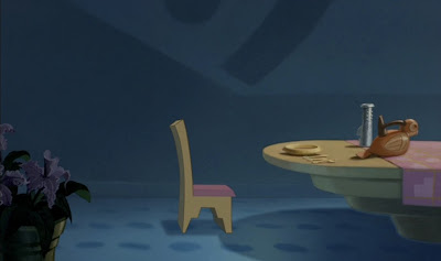
You have decided on your characters, props and environment for your story. All there is left to do is visually represent these elements. It's very easy to build a room that is in nightlight. Or to build a forest that is dominantly full of green leaves and brown bark. That is ok, but we as artists want more. How do you want the viewer to feel during your story? Will the animation be so incredibly well done that it needs nothing more? How can visuals help tell the story?
Disney Pocahontas
What is in the environment should support the story. This goes beyond, my story is taking place in a forest therefore they are in a forest. What I mean here is that if you have characters that are fantasy, what is in the environment that adds to these magical creatures? Maximize your visual storytelling ability by exploiting every opportunity. Reinforce what you want the viewer to feel and think. They may not be aware at all that you are doing this. That the objects that are in your locations tell a story about what will be happening.
Disney Fantasia
Colour can be a very manipulative tool. Think about each colour. For each colour write down as many words as you can to describe it's taste, touch, sound, look, smell and emotion.
Disney Alice In Wonderland
Blue is the overwhelming "favorite color." Blue is seen as trustworthy, dependable and committed. The color of sky and the ocean, blue is perceived as a constant in our lives.
As the collective color of the spirit, it invokes rest and can cause the body to produce chemicals that are calming; however not all blues are serene and sedate. Electric or brilliant blues become dynamic and dramatic, an engaging color that expresses exhilaration.
Some shades or the overuse of blue may come across as cold or uncaring. Blue is the least "gender specific" color, having equal appeal to both men and women.
How the color blue affects us physically and mentally
* Calming and sedate
* Cooling
* Aids intuition
Disney Pocahontas
Disney Alice In Wonderland
Disney Sleeping Beauty
Green occupies more space in the spectrum visible to the human eye and is second only to blue as a favorite color. Green is the pervasive color in the natural world that is an ideal backdrop in interior design because we are so used to seeing it everywhere.
The natural greens, from forest to lime, are seen as tranquil and refreshing, with a natural balance of cool and warm (blue and yellow) undertones. Green is considered the color of peace and ecology. However, there is an "institutional" side to green, associated with illness or Government-issued that conjure up negative emotions as do the "slimy" or toxic greens.
How the color green affects us physically and mentally
* Ill or evil
* Soothing
* Relaxing mentally as well as physically
* Helps alleviate depression, nervousness and anxiety
* Offers a sense of renewal, self-control and harmony
Disney Fantasia
Yellow shines with optimism, enlightenment, and happiness. Shades of golden yellow carry the promise of a positive future. Yellow will advance from surrounding colors and instill optimism and energy, as well as spark creative thoughts.
How the color yellow affects us mentally and physically * Mentally stimulating * Stimulates the nervous system * Activates memory * Encourages communication
Disney 101 Dalmations
Disney Pocahontas
Red has more personal associations than any other color. Recognized as a stimulant red is inherently exciting and the amount of red is directly related to the level of energy perceived. Red draws attention and a keen use of red as an accent can immediately focus attention on a particular element.
How the color red affects us mentally and physically
* Increases enthusiasm
* Stimulates energy
* Encourages action and confidence
* A sense of protection from fears and anxiety
101 Dalmations
Kuskos poison scene in Disney's Emperors New Groove
Purple embodies the balance of red simulation and blue calm. This dichotomy can cause unrest or uneasiness unless the undertone is clearly defined at which point the purple takes on the characteristics of its undertone. It's been said in film making that "if it's purple, someone is going to die." A sense of mystic and royal qualities, purple is a color often well liked by very creative or eccentric types and is the favorite color of adolescent girls.
How the color purple affects us mentally and physically
* Uplifting
* Calming to mind and nerves
* Offers a sense of spirituality
* Encourages creativity
Disney 101 Dalmations
Brown says stability, reliability, and approachability. It is the color of our earth and is associated with all things natural or organic.
How the color brown affects us physically and mentally
* Feeling of wholesomeness
* Stability
* Connection with the earth
* Offers a sense orderliness
We will begin to focus on our conceptual keys and digital painting. Remember there are no wrong ways to approach your paintings. However some tips can help harness your energy.
Begin your focus with value. Use basic shapes to start. An abstract underpainting should be as effective as your finished product.
Be loose and blocky.
Take a step back. Look at the painting from afar to get the whole effect of your composition and lighting.
Build up your painting with hits of colour and contrast. Think about your light source and where the light is hitting. The colour will be it's truest tone in the light and receed into the shadows.