Pages

Monday, November 21, 2011

Art Direction: Use of Colour to Evoke a Mood

You have decided on your characters, props and environment for your story.  All there is left to do is visually represent these elements.  It's very easy to build a room that is in nightlight.  Or to build a forest that is dominantly full of green leaves and brown bark.  That is ok, but we as artists want more.  How do you want the viewer to feel during your story?  Will the animation be so incredibly well done that it needs nothing more?  How can visuals help tell the story?
Disney Pocahontas
What is in the environment should support the story.  This goes beyond, my story is taking place in a forest therefore they are in a forest.  What I mean here is that if you have characters that are fantasy, what is in the environment that adds to these magical creatures?   Maximize your visual storytelling ability by exploiting every opportunity.   Reinforce what you want the viewer to feel and think.  They may not be aware at all that you are doing this.  That the objects that are in your locations tell a story about what will be happening.
Disney Fantasia
Colour can be a very manipulative tool.  Think about each colour.   For each colour write down as many words as you can to describe it's taste, touch, sound, look, smell and emotion.
Disney Alice In Wonderland
Blue is the overwhelming "favorite color." Blue is seen as trustworthy, dependable and committed. The color of sky and the ocean, blue is perceived as a constant in our lives.

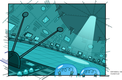
As the collective color of the spirit, it invokes rest and can cause the body to produce chemicals that are calming; however not all blues are serene and sedate. Electric or brilliant blues become dynamic and dramatic, an engaging color that expresses exhilaration.

Some shades or the overuse of blue may come across as cold or uncaring. Blue is the least "gender specific" color, having equal appeal to both men and women.

How the color blue affects us physically and mentally
* Calming and sedate
* Cooling
* Aids intuition
Disney Pocahontas

Disney Alice In Wonderland
Disney Sleeping Beauty
Green occupies more space in the spectrum visible to the human eye and is second only to blue as a favorite color. Green is the pervasive color in the natural world that is an ideal backdrop in interior design because we are so used to seeing it everywhere.

The natural greens, from forest to lime, are seen as tranquil and refreshing, with a natural balance of cool and warm (blue and yellow) undertones. Green is considered the color of peace and ecology. However, there is an "institutional" side to green, associated with illness or Government-issued that conjure up negative emotions as do the "slimy" or toxic greens.

How the color green affects us physically and mentally
* Ill or evil
* Soothing
* Relaxing mentally as well as physically
* Helps alleviate depression, nervousness and anxiety
* Offers a sense of renewal, self-control and harmony
Disney Fantasia
Yellow shines with optimism, enlightenment, and happiness. Shades of golden yellow carry the promise of a positive future. Yellow will advance from surrounding colors and instill optimism and energy, as well as spark creative thoughts.

How the color yellow affects us mentally and physically
* Mentally stimulating
* Stimulates the nervous system
* Activates memory
* Encourages communication
Disney 101 Dalmations
Disney Pocahontas
Red has more personal associations than any other color. Recognized as a stimulant red is inherently exciting and the amount of red is directly related to the level of energy perceived. Red draws attention and a keen use of red as an accent can immediately focus attention on a particular element.

How the color red affects us mentally and physically
* Increases enthusiasm
* Stimulates energy
* Encourages action and confidence
* A sense of protection from fears and anxiety
101 Dalmations
Kuskos poison scene in Disney's Emperors New Groove
Purple embodies the balance of red simulation and blue calm. This dichotomy can cause unrest or uneasiness unless the undertone is clearly defined at which point the purple takes on the characteristics of its undertone. It's been said in film making that "if it's purple, someone is going to die."  A sense of mystic and royal qualities, purple is a color often well liked by very creative or eccentric types and is the favorite color of adolescent girls.  
How the color purple affects us mentally and physically
* Uplifting
* Calming to mind and nerves
* Offers a sense of spirituality
* Encourages creativity
Disney 101 Dalmations
Brown says stability, reliability, and approachability. It is the color of our earth and is associated with all things natural or organic.

How the color brown affects us physically and mentally
* Feeling of wholesomeness
* Stability
* Connection with the earth
* Offers a sense orderliness

Sunday, November 13, 2011

Art Direction: Playing with Colour Keys

[source]
Remember you can always experiment in Photoshop with colour.  By going into the layer dropdown menu and then selecting layer adjustment> colour balance.  Adjust the slides to get different colours instantly!

Art Direction: Colour Keys

Here's an example of some colour keys for a short film.  Our final assignment will require at least 4 colour keys.  These should be taken straight from your story board.  Ideally, all of the board panels can be colour keys and used in your lieca reel for your film before the end of the semester.

How are you going to apply colour to your background?  What about your characters?  I suggest really exploring many different shows and movies to inform your decision.

[source]
Phineas and Ferb has simple backgrounds that do not compete with the characters.  The colours are less vibrant than that of the characters and the lines are cell traced.  Colour bleeds through the line in some areas and stamps and textures are applied to the colour.
[source]
Simple backgrounds in Fish Hooks are spiced up with photographic textures.  This is a different way of using contrast to make the characters pop out from the background.

[source]
Kick Buttowski
Strong contrast is created by use of a less saturated colour scheme and no linework in the background.
[source]
Contrast can be created by using cool vs warm colours.  This can be seen in the picture above with no colour at all, just using a warm grey for the wolf dog, and a cool grey for the female character.
[source]
Use of no line for characters gives a different effect as well.  Less contrast means more use of shadows and highlights to define the form.
[source]
Image on shirt and plaid is a photo that is used as a texture in this character.

Wednesday, November 9, 2011

Mural Group Art Sale


Hello Friends!  I donated an 11x11 digital and traditional painting to the cause below.  We'd love your support!  Love xoxo

We're a group of Art and Design students from Cambrian College who are in the process of designing a mural to enhance the community.

 In order to fund this project, faculty and professional designers have generously donated artwork and print pieces.

 Work is available for purchase - each piece will be printed at 11x17, on demand. Each piece is priced at $20. The full amount will go toward supplies (less printing fees). Any funds donated beyond the cost of supplies will be donated to a community charity of the group's choice.

Artwork sale and pickup can be arranged by contacting Johanna Westby (group advisor) at johanna_westby@hotmail.com, or by any of the following students : Deanna Shields, Chantal Abdel-Nour, Beth Robbins, Chrisanne Daniel, or Matthew Langlois. The Mural Group would very much appreciate your contribution to this effort by purchasing a print today!

More prints can be seen on Facebook.

Monday, October 31, 2011

Life Drawing: Form, Volume and Anatomy

This week in class we'll be reviewing the pelvis as well as introducing the shoulder girdle. It is important to understand the human shape and form.  Combining your knowledge of anatomy and what you see (the model) to complete your drawings will make them more believable, accurate and make you a faster animator. I hope that you are starting to see changes in your drawings and your skill.   Think about what lessons we have learned up to this point.  Break it down into simple steps.  You may only get to one or two steps on shorter poses.  Maybe you'll go through all the elements on longer poses.  Learn to draw with focus on breaking the big task down into small steps.

Line of Action: An imaginary line extending through the main action of the figure. Plan your figure and it's details to accentuate this line. By doing this you strengthen the dramatic effect. The first thing to draw when constructing a figure is the line of action- then build over it. [source]

Flow or Stick Figure:  Using the natural rhythms of the human form to describe the push and pull.


Balance: Hips and Shoulders moving like an accordion.

Proportion:  Take a moment to look at the drawing as a whole.  Apply what you know is true based on proportions of the human form: 
Figure = 7.5 or 8 heads high
pubic bone = 1/2 way point
hands = 1 head 
When the arms are at the side, the wrist bone aligns with the groin area.
The elbow aligns with belly button

**One of the MOST common newbie mistakes is to make the head too big for the body. Especially common is to make the legs too short.  It is almost inevitable that newbie artists do this. But it happens all the time, and we just don't seem to notice it when we are doing it. Measure and check these proportions!  Do it before you put any dark lines down on the drawing, so that any errors will be easier to fix.

[source]
Weight:  Drop a plum line from base of neck or nose. Does this point line up with the grounded foot/feet? 


[source]
Boxes and Cylinders: These help us to see and describe the planes of the figure.  It helps us describe the form and volume three dimensionally. They also help to simplify where the light will hit on the surface of the figure.
[source]

Line Quality: Effective use of soft and bold lines to create depth and weight. If you draw with the same pressure, the line will flatten out your drawing. Use stronger lines on the underside of your figure to help describe weight.  Generally speaking, darker lines will come towards the viewer as lighter ones recede   Be aware of the contrast in your line work.


Assignment #2 Shoulder Girdle Studies - due Nov 22nd
Please submit your drawings in 8.5 x 11 .jpg format and email to tblair007@gmail.com


3 views of the scapula, front, profile and back.

2 views of entire shoulder girdle, sternum and clavicle (front and back)


Sunday, October 23, 2011

"To an overwhelmingly apathetic culture: If you're not passionate about something... anything... what's the point?" - Johanna Westby

Monday, October 17, 2011

3rd Year Design: Television vs Feature Quality BG's

In production there are very economical reasons for doing things the way they are done.  I find it can be completely frustrating when an employer has expectations of their staff to do feature quality work on a television production budget.  Simply put, just comparing backgrounds in television vs. feature, the difference is obvious.

Television needs to be done in clever, quick, appealing ways.  The technique often tends to be more graphic in nature.  Generally, more line art is used in television.

Looney Toones
Paul Bunyan
Samurai Jack
Fairly Odd Parents

Feature requires a little more time and skill. These artists are responsible for the creation of complex backgrounds, landscapes and environments. They require a high skill level in painting, composition, perspective and color.
101 Dalmations
Bambi
Beauty and the Beast
The Little Mermaid
Enchanted
The Lion King
Onto Painting.... I am loving Marco Bucci right now.  He's a hugely talented painter and although I heard a few sighs of "as if I can do that" last time I showed a tutorial from him in class, I think his methods are very simple and straight forward.  I like in this video how he breaks down his process:
Blocking in abstract shapes and values at first.  
Make sure the painting works and reads in the first 5-10 minutes.  
Working with colour temperature, cool and warm colours to create contrast - this will draw your eye 

Friendly Fire

Here's an old class pic of my class at Sheridan.  I'm on the right in the baby blue hoodie!  
Everyone needs a little healthy competition in their lives.  Here's a link to our sister school, Sheridan College!  These are our future colleagues & friends.  Check out their blogs and be inspired!  And please if anyone wants to share their own link with me I will add it onto our blogsite!

http://sheridananimation.blogspot.com/

Passion and Drive

There's much grey area when it comes down to artwork and quality.   Something that is well executed in the opinion of one person might be less so to another.  We as artists need to be very self aware.  I very much believe that we are always growing and learning as artists.  We learn from the people we study with.  We learn from the people we study to become.  We learn from life and our physical environment.  Inspiration and influence is everywhere.  It's in the music we love.  It's in the movies we watch over and over again.  It's in every changing season, on vacation with us and in the architecture of the buildings we pass by.  It's the passion that we have as artists that give us the open eyes to see all this glorious inspiration in our lives.

Without passion, a hundred year old weeping willow is just a tree.  


Without passion, the Notre Dame Cathedral is just a church.


Without passion, Glen Keane is just some dude who draws cartoons.

My question to you is what do you see?


Life Drawing: Some Gestures from the Week.

To create the illusion of depth draw on your knowledge of perspective.  You could help yourself in this type of pose by drawing a box in perspective representing the simple shape that the figure would be contained in.  Marking down the ground plane to weigh down your model and keep him planted.  In this pose, we also have overlapping forms (arms in front of torso, in front of legs) which further helps in creating depth or foreshortening.
You can slightly see my Line of action here in my light underdrawing.  It goes up the arm, down the back and swoops over the hips and down the leg. 


This is an easy line of action here(yellow line).  Figure is properly balanced.  You can see that if you drop a line straight down from the base of his neck, his weight is evenly distributed between both feet.

Woah, can you see the boxes?  I tend to shade two sides of my boxes, especially if that side of the box is in shadow(pelvis).  Simplifies my gestures in quick poses but adds form.  Notice the back of the knee caps showing the perspective/surface line in one stroke.  You can tell that the Left leg is coming towards us, Right leg is angled away.

Left figure is balanced.  Right figure showing form through boxes and a long line of action reaching up.
Can you feel the flow and rhythm of this drawing?

Boxes forming the ribcage and pelvis + flow down legs + balance and proportion = simple clean gesture