How are you going to apply colour to your background? What about your characters? I suggest really exploring many different shows and movies to inform your decision.
 |
| [source] Phineas and Ferb has simple backgrounds that do not compete with the characters. The colours are less vibrant than that of the characters and the lines are cell traced. Colour bleeds through the line in some areas and stamps and textures are applied to the colour. |
 |
| [source] Simple backgrounds in Fish Hooks are spiced up with photographic textures. This is a different way of using contrast to make the characters pop out from the background. |
 |
| [source] |
Kick Buttowski
Strong contrast is created by use of a less saturated colour scheme and no linework in the background.
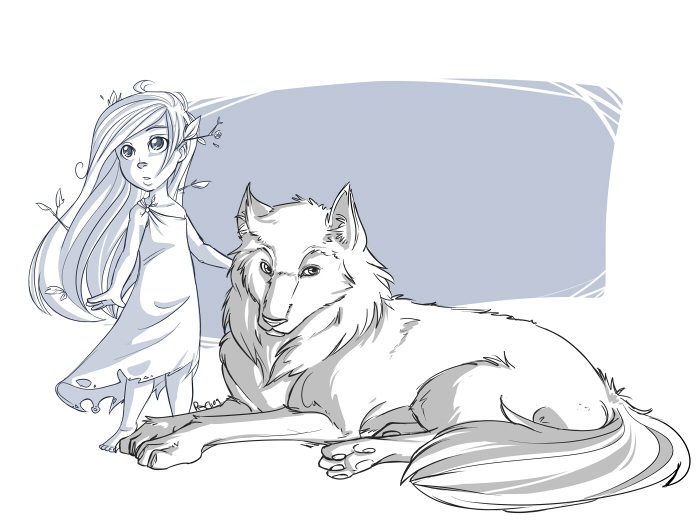 |
| [source] |
Contrast can be created by using cool vs warm colours. This can be seen in the picture above with no colour at all, just using a warm grey for the wolf dog, and a cool grey for the female character.
 |
| [source] |
Use of no line for characters gives a different effect as well. Less contrast means more use of shadows and highlights to define the form.
 |
| [source] |
Image on shirt and plaid is a photo that is used as a texture in this character.


No comments:
Post a Comment