Understanding the bones to memory can be difficult and intimidating. The point isn't to copy the skeleton, but to understand the form, the plane breaks and the relationship between the bones (joints). Here are some more great examples that I found of the bones and how to draw them simply and with accuracy. Check out the original blog to see what the author has to say about this exercise! Another cool link the author mentions is here. This is a link to a website that you can play with the layers of the human anatomy from 360 degrees around the body. Kinda neat, keep in mind for second year studies as well. It may come in handy for the muscle test!
It feels like it was just yesterday, when I was in college studying for my bone test. The dreaded bone test was something I miraculously aced. Notice I am completely cocky about this fact. It is not an easy test. I studied my ass off for this test. I drew for weeks prior to the test. I drew the joints; the knees, the collar, the shoulders, the elbows. Over and over and over again, I would draw and dissect the pelvis. If I remember correctly, the night before the bone test I had the most vivid and horrifying dream about being attacked by pelvises. Imagine Alfred Hitchcock's The Birds. Only in my dream, the birds where flying bat-like pelvises. It was obvious that I was stressed, but I think in some sick way, my brain was helping me out. While I was sleeping, I was still envisioning pelvises rotating from every angle, coming towards me. I'm sure the adrenaline had lots to do with the retention. I rarely remember where my car keys are on a daily basis. But, that morning, I stormed the bone test and got myself a glorious A.
Watch this video and I want you to just think of how you draw. Do you draw from life? Is there passion and soul driving your pencil? Are you telling a visual story? Glen Keane is a master draftman, artist and animator who does all of this and so much more. He is a gleaming example of how drawing from life can make you a great artist. Here are some of his sketches
Glen Keane was born on April 13, 1954 in Philadelphia, Pennsylvania to Bill Keane, the creator of the popular comic strip Family Circus, and the late Thelma Keane, being one of six children. Glen was greatly influence by his father being a cartoonist but found that his style of drawing would soon become very different than his father’s. While Bill didn’t have much formal training and tended to draw more simplistic but sincere drawings, he urged his son to pay close attention to bold, passionate drawings as well as ones that have real life and solid anatomy to them. In the fourth grade he gave Keane a copy of Dynamic Figure Drawing by Burne Hogarth (highly recommended by the author and studying it will make animating worlds easier) and soon he was attending life drawing classes. What Glen did take from his father though was an ability to communicate an expression and feeling through a pose and to make his work clear. He would constantly draw in the desert and found that he had developed a very personal and intimate relationship with drawing and painting.
During high school, however, he was a great football player and wasn’t the typical cartoon geek that a lot of Disney animators come from. After high school Glen had to choose between taking a scholarship to Arizona State to play football and going to the California Institute of Arts to pursue a career in painting and drawing. Since he felt that drawing was like breathing to him and he just had to do it he picked the later option. However an odd twist of fate happened when Keane’s portfolio that was intended to go to the School of Painting was accidentally sent to the School of Film Graphics, where he was accepted. “I never planned to be in animation,” he remembered. “It was something that just sort of happened by accident to me. I wanted to go into painting or illustrating. I just knew I wanted to draw. I didn’t know anything about animation. My portfolio went to Calarts to get sent to the school of painting but somehow or another it got sent to the school of animation, and I was accepted into that. I thought ‘Oh well, I’ll give that a try.’ And I found out about animation. It was a combination of all the arts together. And there was always this sort of ham side of me that wanted to act and I found out animation was really answering that desire. I love to draw figures and realized that animation requires a good understanding of anatomy and figure drawing, so I could use all that information in animation plus acting.”
In the summer of 1973 Keane worked part time at the uninspiring, low quality studio Filmation on some of their poorly made TV series. However everything changed when members of the Disney training program came to the school and presented their tests. “Suddenly I realized I could do that,” Keane fondly remembers. “I didn’t feel I was good enough to be an animator but that I felt I could do.” Around that time he applied for a job at Disney and showed his portfolio to the great Eric Larson. Instead of marveling about what Glen was showing from what he had learned at Filmation, Eric just flipped through the portfolio really quickly, stopped on one drawing (a very simple, rough drawing of a figure), and said that if he could do some more like this one maybe he would have a chance. He also advised Keane to forget everything he learned about animation at Filmation because Disney wanted people who knew how to draw that they could teach how to animate. The young man quickly started spending excessive time sketching and worked hard to improve his skills. In 1974 Glen Keane was hired at the Disney Studio.
You have decided on your characters, props and environment for your story. All there is left to do is visually represent these elements. It's very easy to build a room that is in nightlight. Or to build a forest that is dominantly full of green leaves and brown bark. That is ok, but we as artists want more. How do you want the viewer to feel during your story? Will the animation be so incredibly well done that it needs nothing more? How can visuals help tell the story?
Disney Pocahontas
What is in the environment should support the story. This goes beyond, my story is taking place in a forest therefore they are in a forest. What I mean here is that if you have characters that are fantasy, what is in the environment that adds to these magical creatures? Maximize your visual storytelling ability by exploiting every opportunity. Reinforce what you want the viewer to feel and think. They may not be aware at all that you are doing this. That the objects that are in your locations tell a story about what will be happening.
Disney Fantasia
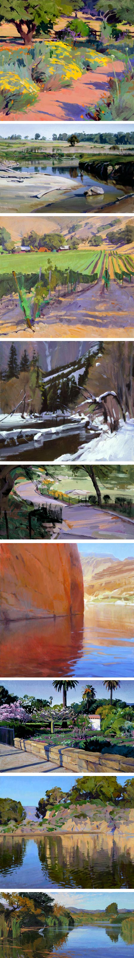
Colour can be a very manipulative tool. Think about each colour. For each colour write down as many words as you can to describe it's taste, touch, sound, look, smell and emotion.
Disney Alice In Wonderland
Blue is the overwhelming "favorite color." Blue is seen as trustworthy, dependable and committed. The color of sky and the ocean, blue is perceived as a constant in our lives.
As the collective color of the spirit, it invokes rest and can cause the body to produce chemicals that are calming; however not all blues are serene and sedate. Electric or brilliant blues become dynamic and dramatic, an engaging color that expresses exhilaration.
Some shades or the overuse of blue may come across as cold or uncaring. Blue is the least "gender specific" color, having equal appeal to both men and women.
How the color blue affects us physically and mentally
* Calming and sedate
* Cooling
* Aids intuition
Disney Pocahontas
Disney Alice In Wonderland
Disney Sleeping Beauty
Green occupies more space in the spectrum visible to the human eye and is second only to blue as a favorite color. Green is the pervasive color in the natural world that is an ideal backdrop in interior design because we are so used to seeing it everywhere.
The natural greens, from forest to lime, are seen as tranquil and refreshing, with a natural balance of cool and warm (blue and yellow) undertones. Green is considered the color of peace and ecology. However, there is an "institutional" side to green, associated with illness or Government-issued that conjure up negative emotions as do the "slimy" or toxic greens.
How the color green affects us physically and mentally
* Ill or evil
* Soothing
* Relaxing mentally as well as physically
* Helps alleviate depression, nervousness and anxiety
* Offers a sense of renewal, self-control and harmony
Disney Fantasia
Yellow shines with optimism, enlightenment, and happiness. Shades of golden yellow carry the promise of a positive future. Yellow will advance from surrounding colors and instill optimism and energy, as well as spark creative thoughts.
How the color yellow affects us mentally and physically * Mentally stimulating * Stimulates the nervous system * Activates memory * Encourages communication
Disney 101 Dalmations
Disney Pocahontas
Red has more personal associations than any other color. Recognized as a stimulant red is inherently exciting and the amount of red is directly related to the level of energy perceived. Red draws attention and a keen use of red as an accent can immediately focus attention on a particular element.
How the color red affects us mentally and physically
* Increases enthusiasm
* Stimulates energy
* Encourages action and confidence
* A sense of protection from fears and anxiety
101 Dalmations
Kuskos poison scene in Disney's Emperors New Groove
Purple embodies the balance of red simulation and blue calm. This dichotomy can cause unrest or uneasiness unless the undertone is clearly defined at which point the purple takes on the characteristics of its undertone. It's been said in film making that "if it's purple, someone is going to die." A sense of mystic and royal qualities, purple is a color often well liked by very creative or eccentric types and is the favorite color of adolescent girls.
How the color purple affects us mentally and physically
* Uplifting
* Calming to mind and nerves
* Offers a sense of spirituality
* Encourages creativity
Disney 101 Dalmations
Brown says stability, reliability, and approachability. It is the color of our earth and is associated with all things natural or organic.
How the color brown affects us physically and mentally
* Feeling of wholesomeness
* Stability
* Connection with the earth
* Offers a sense orderliness
Remember you can always experiment in Photoshop with colour. By going into the layer dropdown menu and then selecting layer adjustment> colour balance. Adjust the slides to get different colours instantly!